In 1949, the great agiographer Fotis Kontoglou wrote “The Mourning Synaxary of Constantine the Palaiologos”. It was published in the “Kivotos” magazine, in 1953 and was republished in his book “The Painful Romiosy”, in 1963.
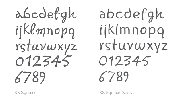
The diversity of the Kontoglou’s incomparable way of writing as well as the plethora of the unconventional and astonishing ligatures can only be compared with the works of the old Byzantine calligraphers! The inspiration for the “Synaxis” and “Synaxis Sans” font families came from this famous manuscript, hoping to bring a small sense of the style of the prototype.
The “Synaxis” family consists of a single weight and a set of 650 greek lowercase ligatures. Due to the complexity of the character format it needs special treatment in its use on the computer. It supports the complete Greek polytonic and Latin writing system.
The “Synaxis Sans” family is a more modern and minimalistic depiction of the previous one, with a smoother typographic character, but always close to the style of the original. It consists of 4 weights (Normal, Italic, Bold and BoldItalic) and contains a small set of Greek upper and lowercase ligatures. It supports the complete Greek polytonic and Latin writing system.


